Latest App Releases and Updates
According to the editors on this site, these apps are the latest releases and updates.
Kino: Halide Team Launches ‘For Dummies’ Professional Photography App
Maybe when you see this title you will have a slight doubt, why the two attributes of ‘foolproof’ and ‘professionalism’ can co-exist? Actually, this is where the value of developer Lux Team’s work lies. This team of former Apple designers focuses on providing iPhone users with a high-quality photography experience. If you know Halide, a third-party photo app, you should be able to sense the style of the Lux team’s work, which is dedicated to presenting a professional tool to users in a “simple” way. Professional users can get powerful features with this tool, and ordinary users can also feel the charm of photography through this tool, and at the same time can learn step by step through the built-in guided tutorials in the app. In the same mode, Lux team launched a new iPhone photography app — Kino, focusing on professional photography, one-click generation, cinematic effects and other features.
As a preview, I’m going to focus on Kino’s interface and features in this review, with more in-depth experience to come in a separate review. Kino’s design language is similar to Halide’s, in that it shows you a very simple, easy-to-use UI that even someone with little to no knowledge of photography can get started with.
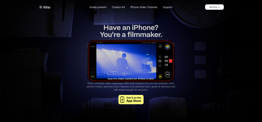
When you turn on Kino, there is no startup screen or loading screen, and it goes straight to the shooting interface. In the main interface, Kino’s elements in landscape and portrait modes are identical, with only a slight change in layout. Taking landscape mode as an example, before recording, we can see that Kino’s shooting interface consists of four main parts: the center is naturally the viewfinder window, the left side is the recording time and audio level from top to bottom, the top is the auto/manual switch and the format selector from left to right, the first layer on the right side is the quick toolbar, the lens switch, and the focus mode switch, and the second layer is color correction, recording buttons, and the second layer is the color correction, recording buttons, and the second layer is the color correction, recording buttons, and the second layer is the color correction, recording buttons, and the second layer is the color correction, recording buttons. are Color Correction, Record button and Recent Shots.
If you are a novice photographer, you don’t need to adjust any settings, just click the record button to start recording, all the shooting settings are in auto mode, which will be adjusted automatically according to the shooting environment and subject. If you need to adjust the parameters such as focus, exposure, shutter, etc., you can do so separately by sliding the screen after clicking the corresponding button.
If you need additional auxiliary functions, they can be found in the Quick Toolbar. After tapping the Quick Toolbar button to expand a new area, you can see Settings, Flip Front/Rear Lens, Grid and Levels, Frame Stabilizer, and RGB Waveform Maps, which are tools that professional users can use to get a better shooting experience.
As one of the main points of differentiation from other iPhone photography apps, Kino’s color correction feature has many built-in presets from professional agencies or photographers, as well as the ability to import our own LUTs, which makes using color correction in Kino simple compared to the workflow of a professional camera – all we need to do is to find a preset that we like before recording, and then tap Apply. All we have to do is find the preset we like before recording and click Apply, which renders the image in real time as we shoot. If you want to change the color preset after you’ve finished shooting, you can edit each video again in the Recent Recordings screen to pick the preset you like. Another interesting feature of Kino is AutoMotion, which is enabled by default in the settings, meaning that Kino automatically exposes the camera based on the 180° shutter angle for a natural motion blur effect and a more cinematic look.
Compared to other iPhone professional photography apps, Kino is the first third-party photography app that I really want to use on a daily basis because it’s “dumb” enough to satisfy my occasional advanced needs.
How We Feel: Focus on Yourself
After falling into a sense of anger at my inability to make a change and disgust at my endless work after yet another meeting, I realized that I’ve been having so much negativity in recent times, and that this negativity was such a large part of my life that I could only remember some of the negative events associated with it. Yet just two days ago I went out with a friend and got a good lunch, picked out clothes I was still happy with, and had a rare chance to relax at the movies. Often times we magnify the negative and forget about the positive.
How We Feel wants us to be more aware of our emotions, identify the events that affect us, and gradually learn to adjust and even control our emotions. After downloading the app, How We Feel gives you a very detailed guide, the overall interface is very beautifully designed, and new users are advised to follow along and explore the main functions of the app. After clarifying the purpose of using the app, How We Feel guides us to categorize our emotions into four quadrants: High Energy Pleasure, High Energy Unpleasantness, Low Energy Pleasure, Low Energy Unpleasantness, and then we are able to see the specific types of emotions that correspond to each quadrant.
How We Feel is unique in that most mood tracking apps will list a bunch of emotions to choose from, but it’s up to us to define exactly what these emotions belong to and what they mean, and over time we fill in the blanks for “angry”, “happy”, and “sad”, while further subdivided emotions are often overlooked, such as “proud”, “surprised”, “inspired”, and “overwhelmed”. How We Feel lists the specific emotions and also gives an explanation of the corresponding emotions, which allows us to understand the meaning behind the emotions in short words, thus encouraging us to describe our feelings more accurately.
Once we’ve recorded our emotions, we can also write about the events that affected them, and the app supports text, voice, and image recording, and even lets us record our sleep, exercise, and even the weather, to help us discover the subtle effects of specific activities on our moods. As we continue to record, How We Feel gives us a wealth of statistics and generates beautiful graphs.
In addition, the longer we use it, How We Feel unlocks a series of lessons in the toolbar, including self-affirmations, breathing exercises, Mood 101, and more, so we can learn and put together our own favorite regimen. Finally, How We Feel also has a simple social feature built in, which allows users to choose whether or not to use their Google account to log in to the app and share their emotions with other friends, but of course the account feature isn’t mandatory, so it’s up to the user to make the choice. How We Feel is currently free and can be downloaded via the App Store or Play Store for a journey of self-discovery.
Usage: An Elegant MacOS Status Monitoring Widget
Although macOS has a built-in activity monitor to see how much CPU, memory, network, etc. is being used, it’s not directly available on the desktop (you can only see it from the dock), and it’s not intuitive enough, so I’ve been using third-party apps to monitor my system’s status from the menu bar. I’ve been using iStat Menus, which is powerful but now has an outdated UI that doesn’t look right on macOS, so is there a macOS status monitoring utility that’s both aesthetically pleasing and useful?
Usage is a system status monitoring tool similar to iStat Menus, but the biggest difference is that Usage is not only for macOS, but also supports iOS and iPadOS, and what attracts me the most is that it adopts the macOS design style of recent years, almost all the information is in rounded corners, which is quite pleasing to the eyes. It’s very pleasing to the eye.
In terms of functionality, Usage offers a main interface that provides an overall overview of the system’s condition. You’ll find a number of tabs for information on power, battery health, disk usage, processor, RAM, network, Bluetooth connectivity, and overall device uptime, and if you don’t like the graphical presentation of the overview, clicking on Configure at the top-right corner of the tabs allows you to change the color of the icons, the type of graph, the timeline display mode, and the number of swipes you can make. If you don’t like the way the charts appear in the overview, click Configure in the upper-right corner of the tab to configure and customize icon colors, chart types, timeline display modes, refresh rates, and cloud synchronization.
For macOS users, the most important thing is to edit the menu items, directly through the icon on the menu bar, you can understand the current status of the system at a glance, in Usage can also do a high degree of customization, you can choose the battery, processor, network, memory, disk, charts, the different indicators in the device to add to your menu bar, for example, I chose the CPU total load For example, I chose the icon for Total CPU Load + Processor Temperature + Network Activity, which is more than enough for me, and for more detailed information, you can expand it by clicking on the icon in the menu bar and then clicking on the popup.
Usage also provides a popup prompt for the menu bar icon, and in addition to the default memory and processor load cards, you can add more cards by clicking “Add Component” at the bottom. For example, I’ve added detailed cards for “Memory,” “CPU Load,” “Network Activity,” “Bluetooth Devices,” “Disks,” and “Processor Temperature”. For example, I’ve added detailed cards for “Memory”, “CPU Load”, “Network Activity”, “Bluetooth Devices”, “Disk”, and “Processor Temperature”. In addition, you can adjust the combination of the popup alerts.
What’s the point of having widgets for general-purpose applications? In Usage, widgets can also be placed in the sidebar, but here they are medium-sized, which I think takes up a lot of space. All in all, Usage is a pretty comprehensive monitoring tool, but I’m most pleased with its “modern” design and the fact that it’s available for both iOS and iPad OS.
Ghost Commander: A Multi-Window File Manager That Still Works
Android has evolved to Android 14, and the file manager apps in the customized systems of various cell phone manufacturers are getting better and better, but there seems to be little improvement in terms of functionality. I think the primary function of a file manager is to make it easier for us to copy, cut, and so on, so I’ve always wanted a file manager that supports multi-window operations on Android, and Ghost Commander fits the bill.
Ghost Commander is not a new product, and its UI design is now considered “vintage”, very similar to Total Commander on Windows, which seems to tell users that the more powerful a file manager is, the more “hardcore” it will look.
Ghost Commander realizes the “split-window” function in the form of tabs. When we copy and move files, traditional file manager apps require you to long-press to select the file, and then move the window one layer at a time to the target address before you can paste it, and if you are not careful, you may quit the app and “lose everything”. But in Ghost Commander, we only need to open the target address in one panel, then select the file to be copied or moved in another window, and confirm the path in the popup window (no need to manually input the path).
Ghost Commander puts all the common actions at the bottom of the screen in the form of buttons, which can be customized and sorted in the settings. If you look closely, you’ll see that these buttons are labeled with symbols or numbers in front of their names, which represent “keyboard shortcuts”. So if you’re using Ghost Commander on an Android tablet, it might be more efficient. Overall, Ghost Commander is still a very efficient file manager even though it’s a bit old. If you’re in the market for something like this, you can download it for free from SourceForge.
Controller for HomeKit 7.0: “Photographing” Home Floor Plans with Your Hands
Last week, Controller for HomeKit was upgraded to version 7.0, which not only optimizes the usability of the UI, but also brings a new control experience. Now you can control your smart home devices more intuitively on a floor plan.
To create a detailed floor plan of your home, you first need a LiDAR-enabled iPhone or iPad device. Tap the Discover button in Floor Plan at the top of the home screen to get started. Simply scan your entire house with the camera once, and the app will draw a 3D rendering of your entire home based on the information obtained from LiDAR, and automatically recognize the various types of homes. Note that it’s recommended to remove any temporary clutter from the wall when scanning, for example, my first scan gave me a crooked wall because of a panel that was temporarily placed next to the dining room wall.
Once the scan is complete, the Controller presents the room layout in a top-down view, based on an intuitive flat surface, with 3D effects to further enhance readability. You can also label devices, rooms, scenarios, workflows, and more, and click on them to manipulate them or jump to them. In addition, version 7.0 provides two new desktop widgets that make it easy to jump from floor plan to floor plan.
While this way of controlling smart devices is new, the new UI optimization seems to be more effective in terms of efficiency. Unlike the previous version, which stacked devices and scenes in lists, 7.0 has a clear sense of ‘segmentation’, with an intuitive floor plan and camera screen at the top, and room areas at the bottom, where you can quickly jump from room to room with different pattern markers, and see what devices and automation settings are available under each room.
Efficient workflow is one of Controller’s strengths, but previously it relied mostly on automation, with manual operations still done through the home app and Siri. With the new version, you can add your favorite scenarios and workflows to your favorites and display them on the first screen or in a widget, so workflows that require manual intervention can be realized more efficiently. Controller for HomeKit is available on macOS, iOS, iPadOS, and watchOS platforms on a subscription basis. Annual subscriptions are available for a 7-day free trial, so it’s recommended that you try before you pay.
Microsoft Launcher: The beta update adds support for Copilot and enables image generation and text generation directly with simple text.
Pocket Casts: The official update to 7.64 brings three sizes of widgets, a “to-be-played list” on the home screen that’s now part of the bottom bar, a mini-player that no longer docks on the bottom bar but floats in the interface, and a gap in the grid between podcasts.
Spark: The new version of the desktop has integrated calendar functionality and can now link to Google, Exchange, and iCloud calendars.
Posted on June 1, 2024 uninstalledly editor